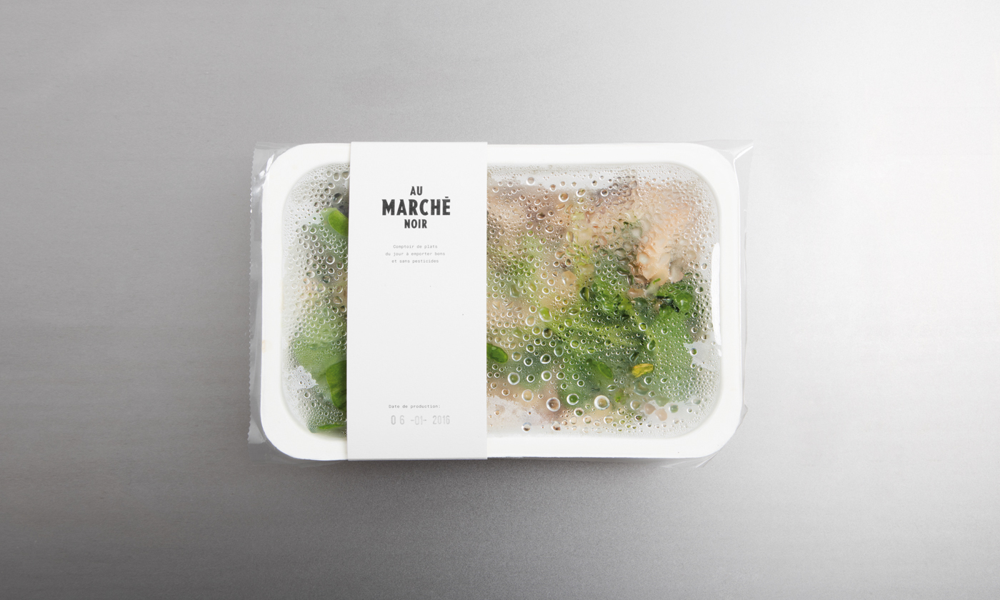
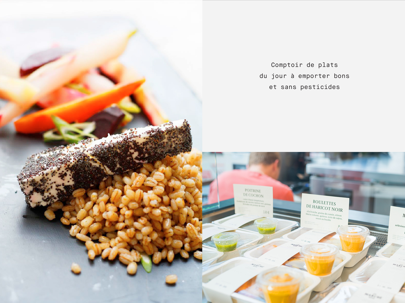
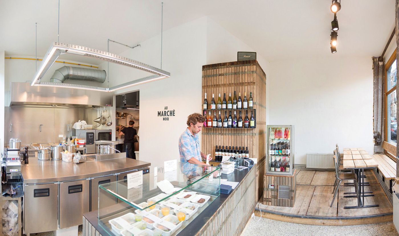
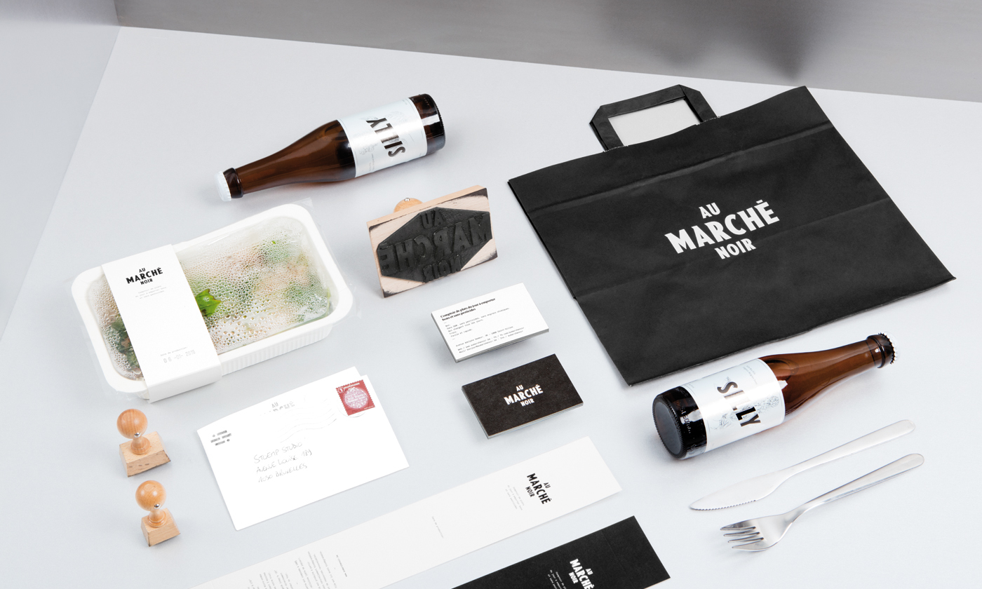
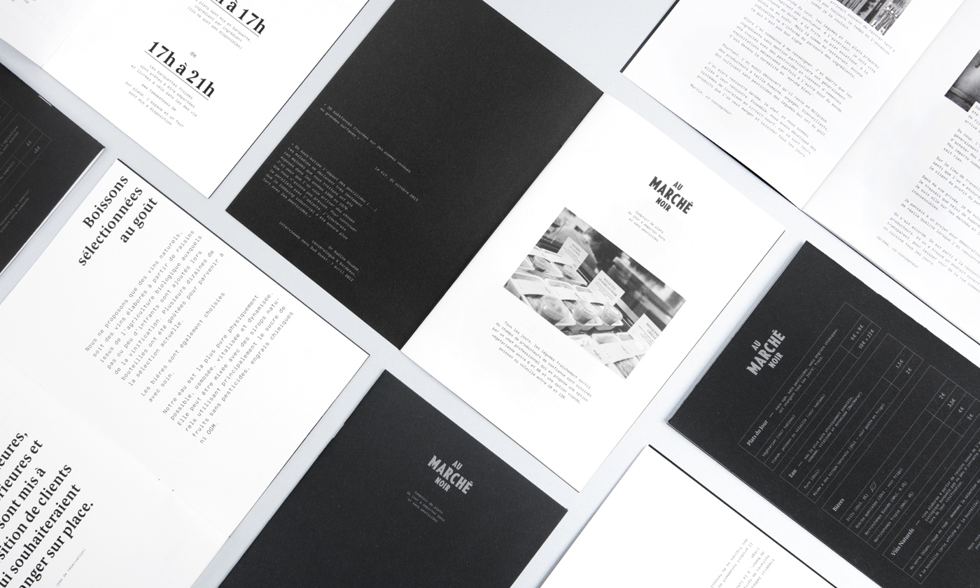
A uMarché noir是布鲁塞尔市中心的一家餐厅,专门供应来自当地农产品的新鲜,有机和健康的食物。 我们开发了餐厅的整个视觉识别 - 这包括标志,颜色,排版和包装。
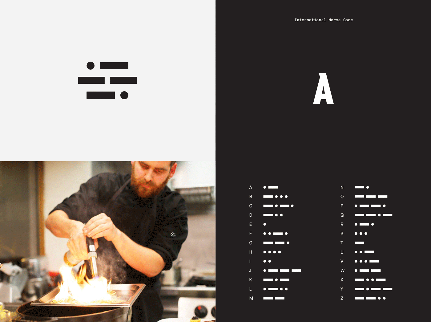
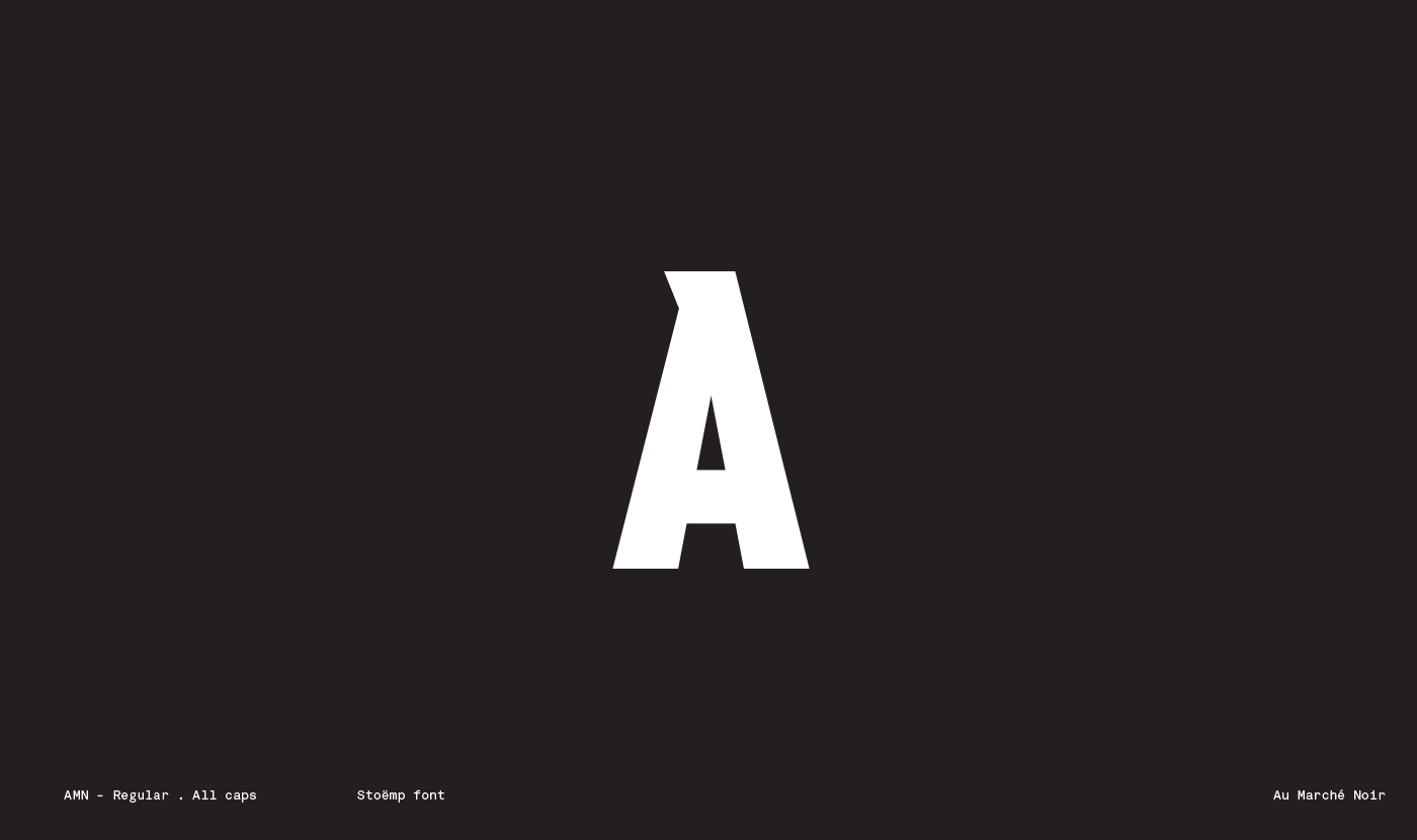
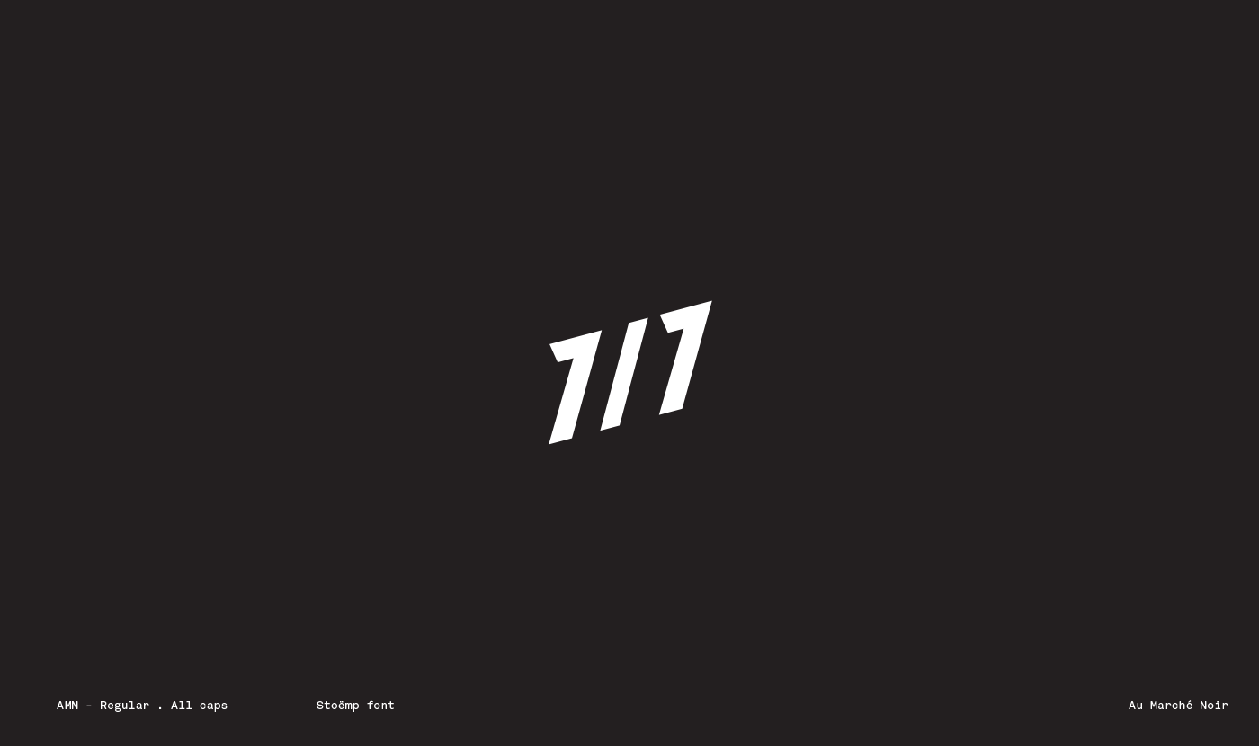
Marchénoir翻译为“黑市” - 这个概念是消费者能够根据每天改变的菜单找到独特而难以找到的菜肴。 我们从旧战后报纸的影响力来绘制定制排版,我们基于图形上的莫尔斯电码的可视化。
主要的想法是创建一个简单的小身份,使视觉设计不会压倒品牌的独特概念。
A visual identity that represents the core concept of the brand
Au Marché noir is a restaurant in the heart of Brussels, which focuses on serving fresh, organic and healthy food from local produce. We developed the restaurant’s entire visual identity – this included the logo, colours, typography and packaging.
Marché noir translates to ‘black market’ – the concept is that consumers are able to find unique and hard to find dishes based on a menu that changes every day. We took influence from old post war newspapers to draw a bespoke typography and we based the pictogram on the visualisation of morse code.
The main idea was to create a simple and minimal identity so that the visual designs wouldn’t overpower the unique concept of the brand.

此文章仅用于学习交流使用,不涉及任何版权、知识产权问题,如有疑问请联系我们。
在于设计创造品牌个性——为那些依靠改变繁荣发展的品牌。